Chick-fil-A // Service + Store Design
PROJECT/
Chick-fil-A had the best kind of problem. More people wanted to eat their food than they could serve. But folks would show up, see the long lines, and decide to go somewhere else. They figured that they had a line problem, and needed a better way to queue people up.
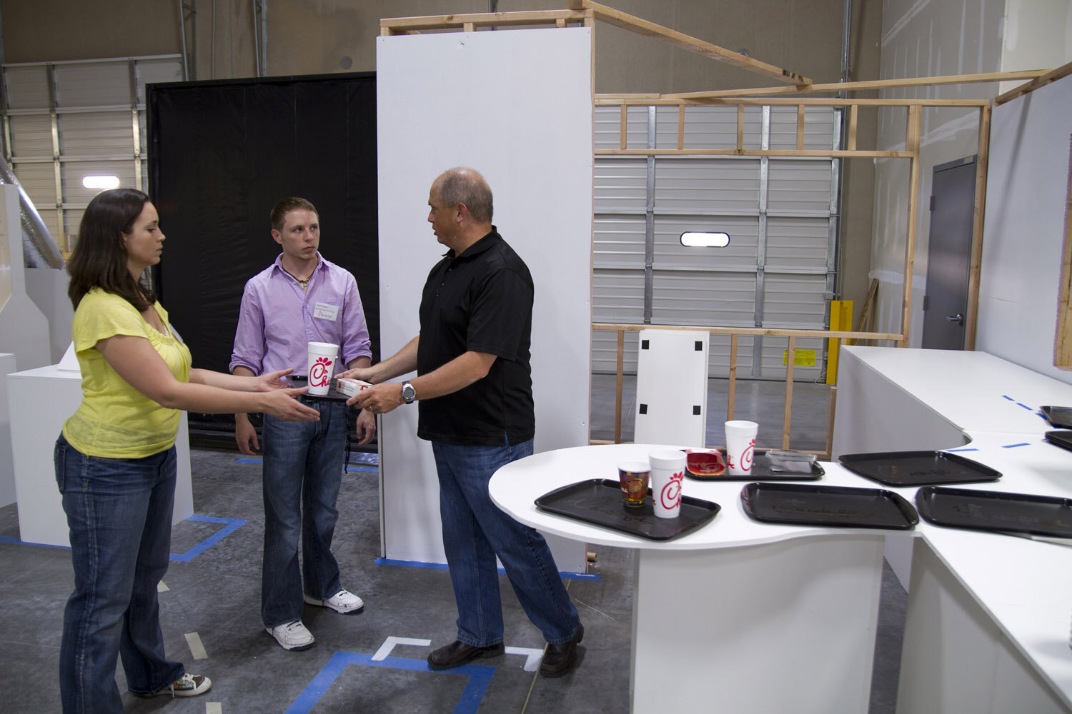
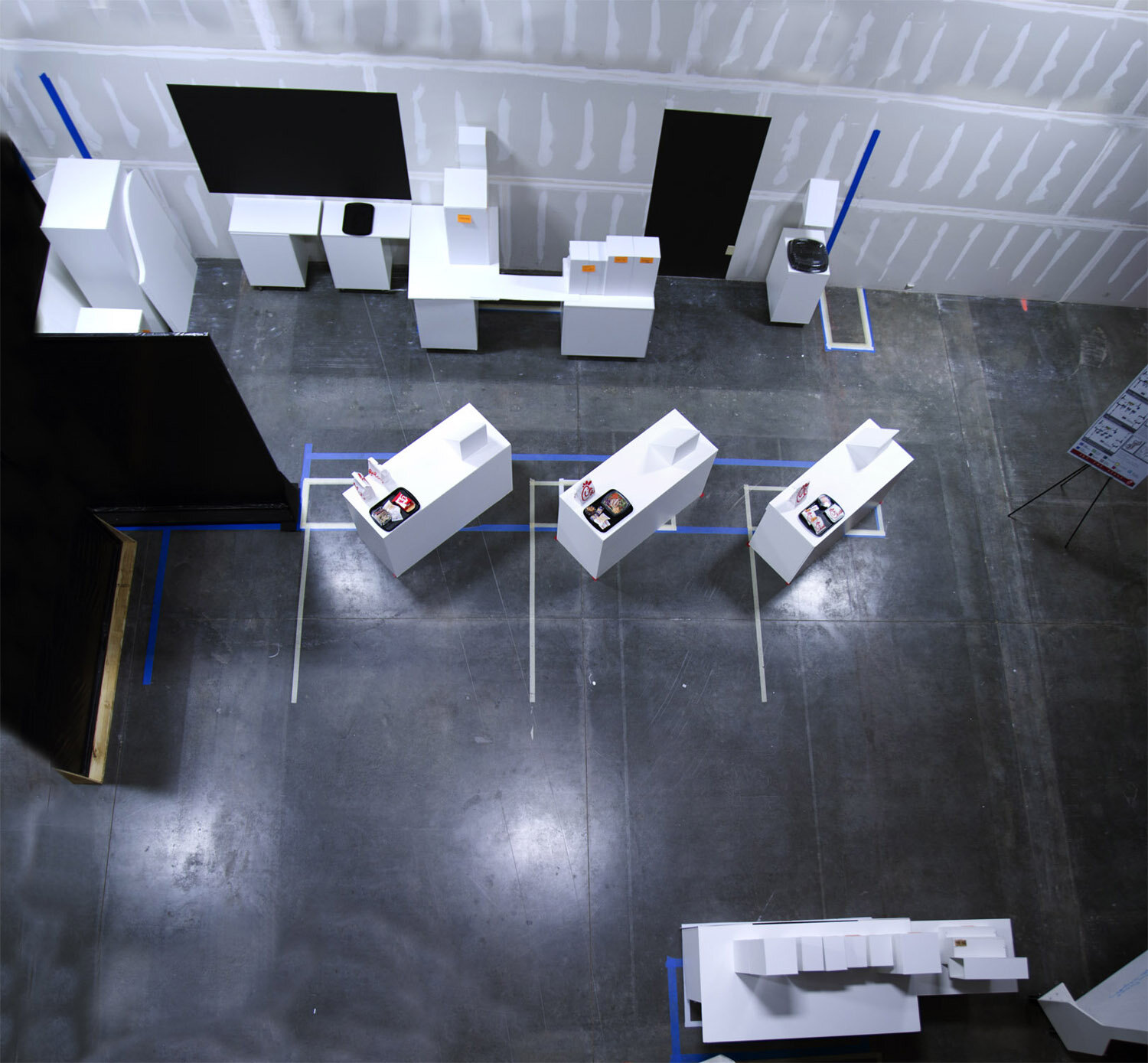
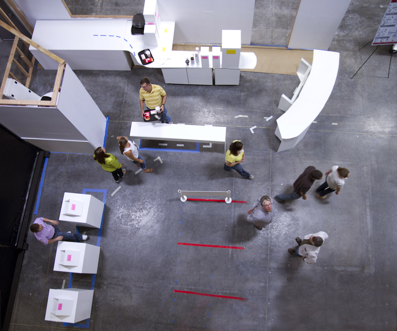
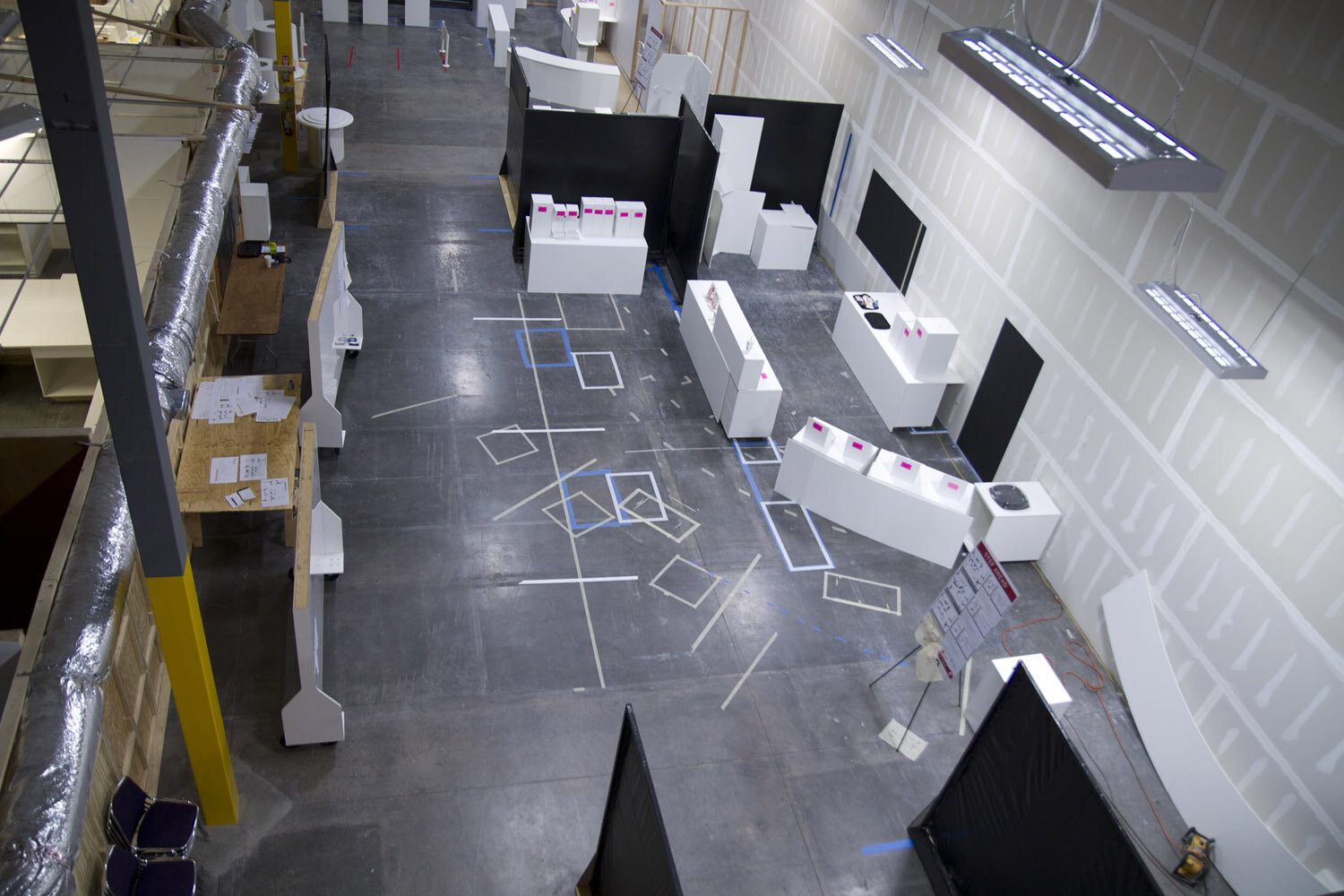
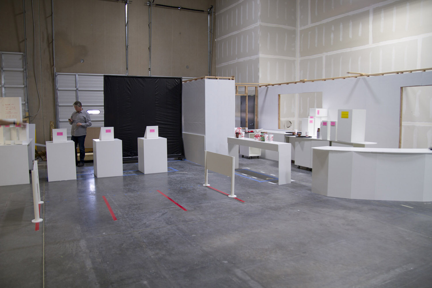
But as we worked with them on new ways to get folks in line, we kept bumping up against the wait-for-your-tray-at-the-counter service model. So we took a step back and looked at a range of service models. Then we came up with floor plans customized for each. To try them out, we built 13 different store layouts, at full scale, out of foam core, in a warehouse. We wanted to be able to do side by side comparisons, so we we built the stores 3 at a time. We lived in them, hacked off bits, glued others on, and evolved the team’s point of view.
RESULT/
If you walk into a Chick-fil-A today, you can see our work in the flesh. Waiting at your table hardly feels like waiting, compared to standing at the counter. And by implementing the ordering app concept we designed, Chick-fil-A has turned every table and every parking space into a point of purchase.
Breakthroughs require disruption. Experience prototypes like these let companies explore a large number of possibilities as cheaply and as quickly as possible. They are low risk way to evaluate your ideas, while generating new ones. Plus, conversations about design happen a lot more fluidly if everyone is talking about the same thing. Experience prototypes are and extremely effective way to create a shared frame of reference.


